“Data science is an interdisciplinary field of scientific methods, processes, algorithms and systems to extract knowledge or insights from data in various forms, either structured or unstructured, similar to data mining.”
-Wikipedia
So there you have it. The world’s foremost crowd sourced definition of what data science is. While I don’t disagree with the collective wisdom of Wikipedia, I would like to offer a slight alternative in the form of what I consider to be the archetypical illustration of what data science ought to be: Google Maps.
First, yes, I realize that an example, archetypical or not, is, by definition, not a definition. And second, can we for a moment appreciate the number of commas I was able to cram into that sentence? Now moving on to three, let’s get back to one.
The point I wish to make here is this, data science as it is typically is described really offers no more insight into what it is than can be inferred from the term’s raw grammatical structure. Data science is the science of data, and science is just structured investigation, ergo data science is the structured investigation of data, i.e. the definition we just read from Wikipedia.
But while technically accurate, I think this line of explanation belies an important aspect of science critical to its effective use, which is its connection to art. Dr. Featherstone wrote an interesting piece on this topic, which I’ll leave to you to enjoy in its entirety, but the main point I wish to steal is that both science and art arise from our need as humans to understand the world we live in and to communicate that knowledge to others.
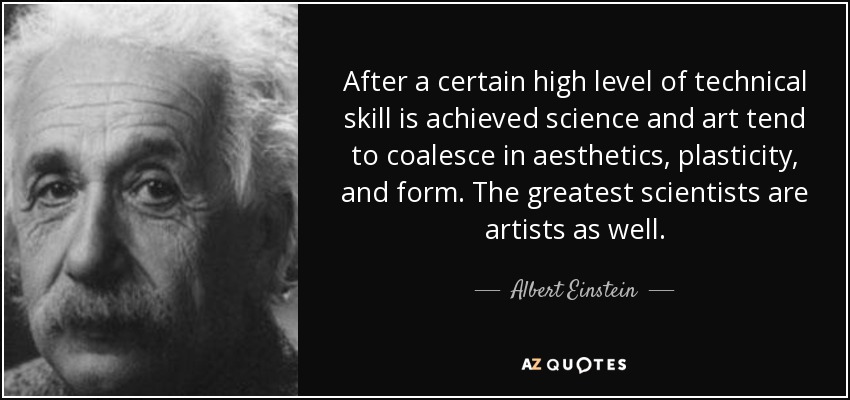
Or as Einstein put it
While I think most data scientists would agree with Einstein (and if you don’t, it doesn’t really matter because he’s Einstein and you’re, well not) being data scientists I think we often forget about the aesthetics of what we do. Which brings me back to why I think Google Maps represents to large degree the ideal example of how data science ought to be. Google Maps has an aesthetics that I absolutely love. And when I use the term aesthetic, I don’t so much mean in terms of the stylistic design of the app, but rather in the simplistic elegance of how it represents its value to the end user which it does by:
- Showing you a map (context)
- Showing you where you are on the map (relevance to you)
- Showing you several options on how to get where you want to go (actionable info)
- Showing a comparative ranking of the options in terms drive time
- Justifies its estimates of drive times by showing you visually both distance and traffic on each route
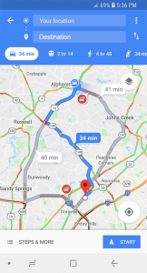
And it does all of this in an interface that takes no more than a few seconds to look at and understand. In other words, it hides all of the complexity of Dijkstra’s shortest path algorithm being run on a network whose edge weights are updating in real time off billions of data point pulled from millions of users and instead shows the user simply the relevant state of the world (traffic colored map), their position in that world, and a few options on how they can get to where they want to go. And that, in my opinion, is what data science ought to be.